Frit Ravich Core Range
- Packaging
Frit Ravich unveils the new design of its core nut range, aimed at connecting with a broader audience while educating and highlighting the unique qualities of its products.
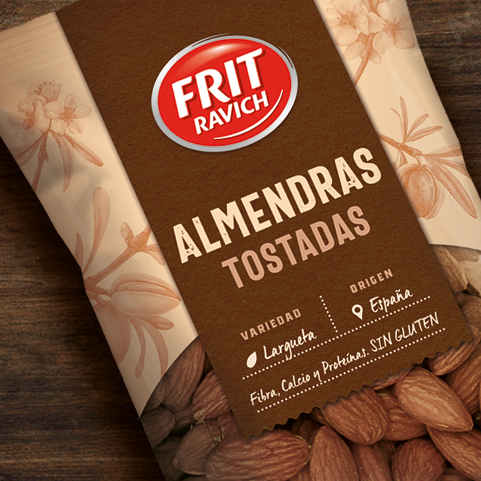
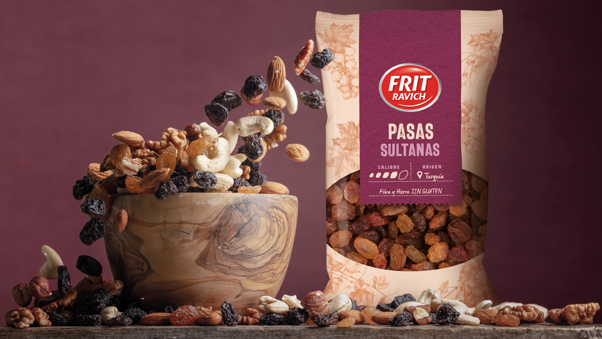
The primary goal was to create a design that conveys naturalness and craftsmanship while maintaining clear and accessible communication for the consumer. We introduced an informative front label that highlights the origin, size, and benefits of each variety, ensuring a more intuitive and educational navigation.
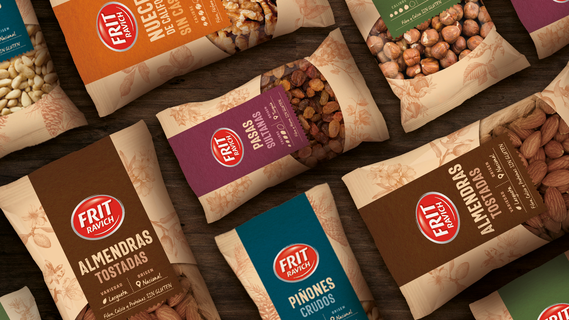
To reinforce the perception of freshness and quality, we developed a clean and organized design with a visual hierarchy that allows for easy identification of different varieties. The aesthetic leans toward a natural look, preserving the brand’s accessible essence while avoiding an overly premium approach.
The result is a clear, functional, and visually appealing portfolio that enhances product visibility and provides valuable consumer information, positioning Frit Ravich as a trustworthy and authentic choice in the nut segment.
*Designed for More Amor Brands.
