Hello! We are Primavera, a design studio specialized in packaging, brand creation and communication.Hello! We are Primavera, a design studio specialized in packaging, brand creation and communication.
Hello! We are Primavera, a design studio specialized in packaging, brand creation and communication.Hello! We are Primavera, a design studio specialized in packaging, brand creation and communication.
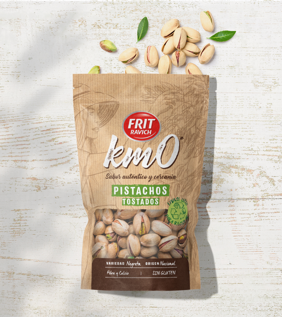
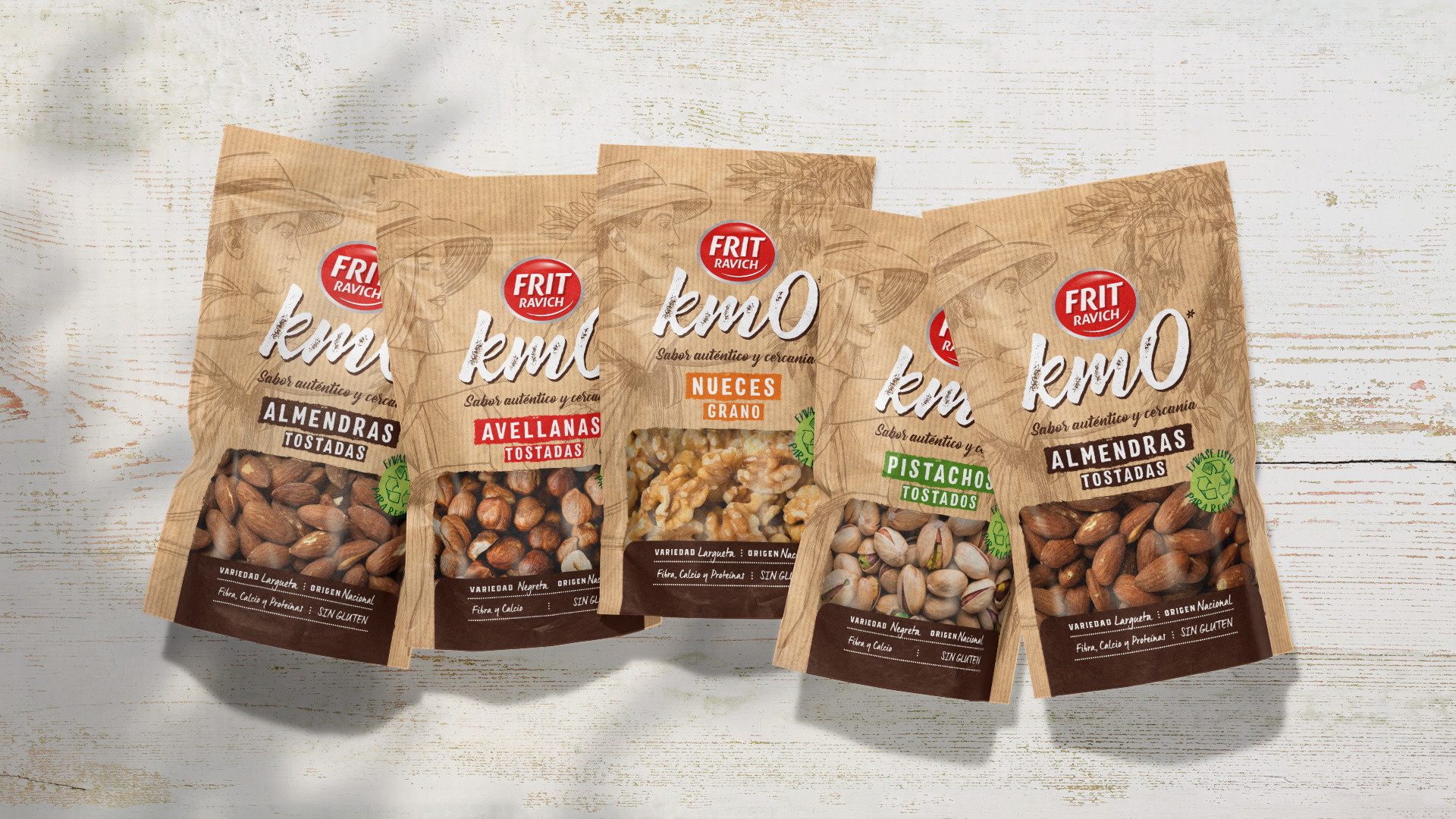
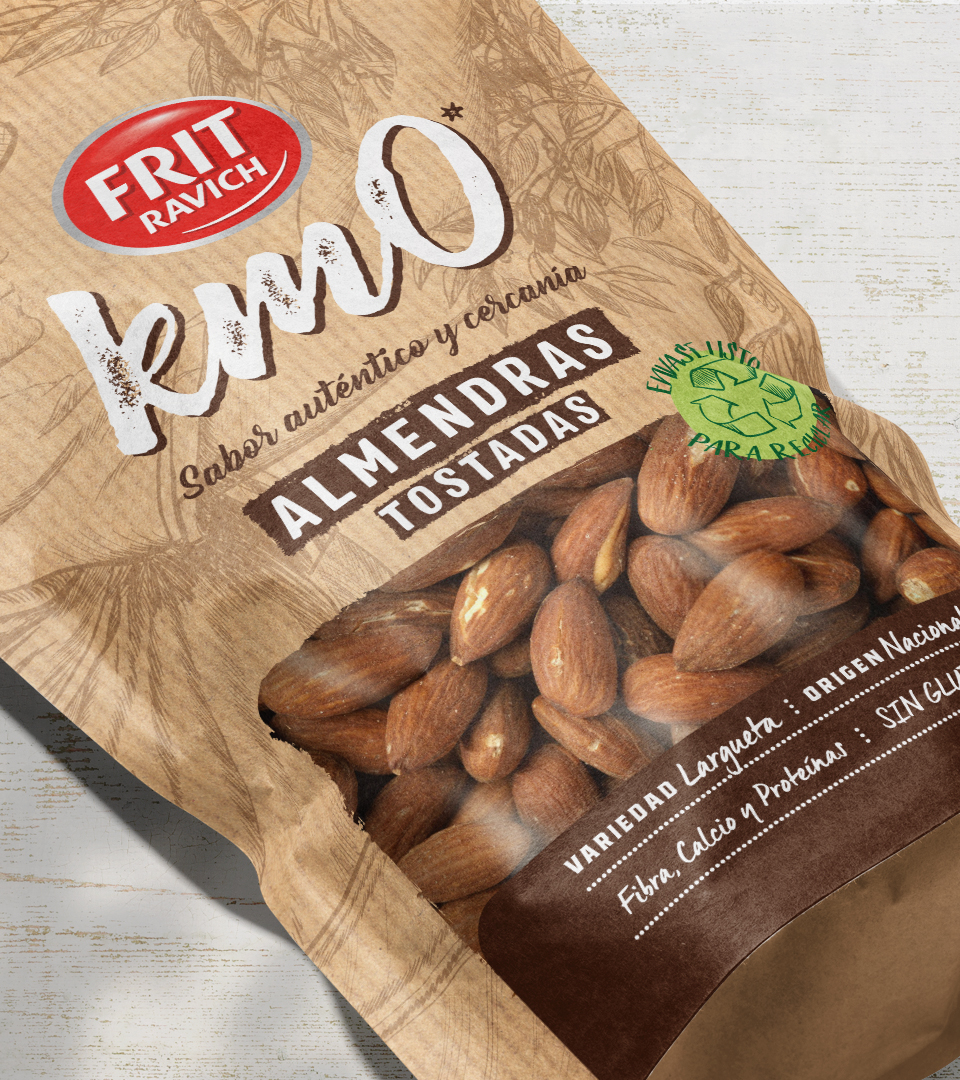
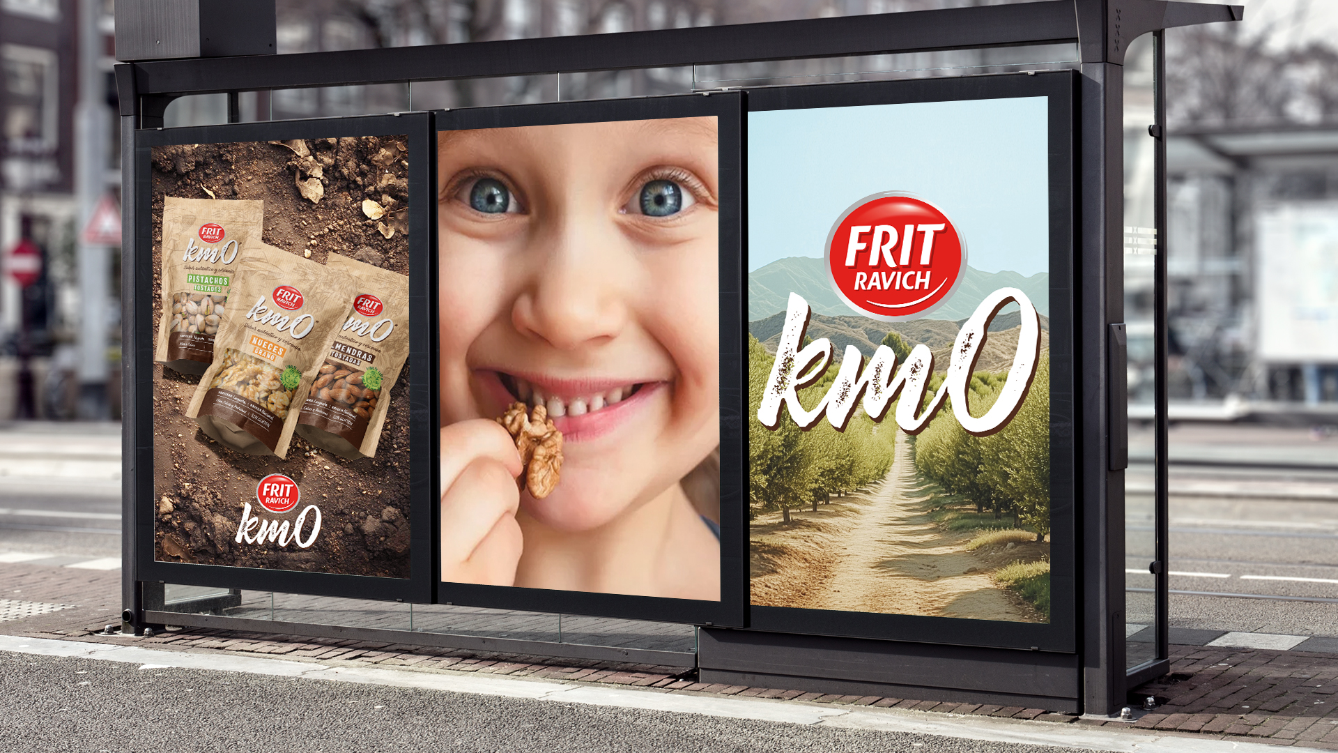
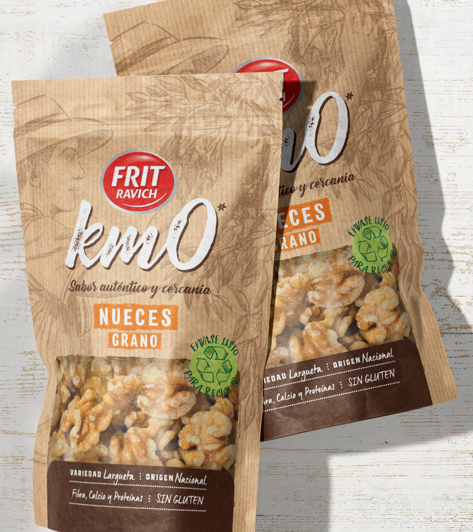
Frit Ravich launches a new range of locally sourced nuts, emphasizing quality, naturalness, and a commitment to local products. This line aims to convey values of craftsmanship and closeness, setting itself apart from the Core range with a more premium yet accessible approach.
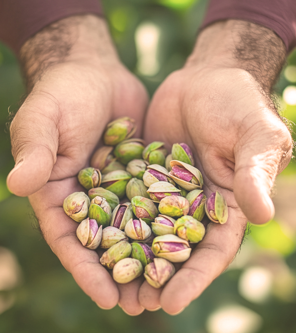
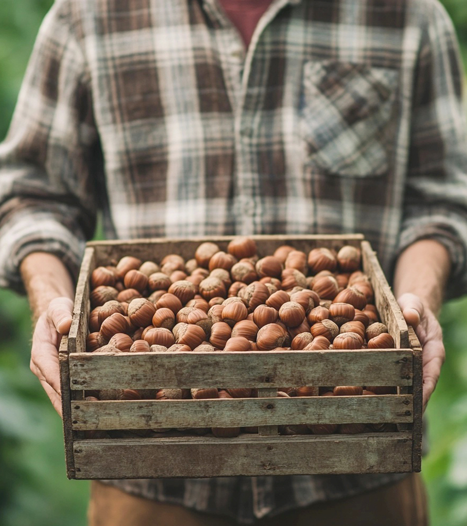
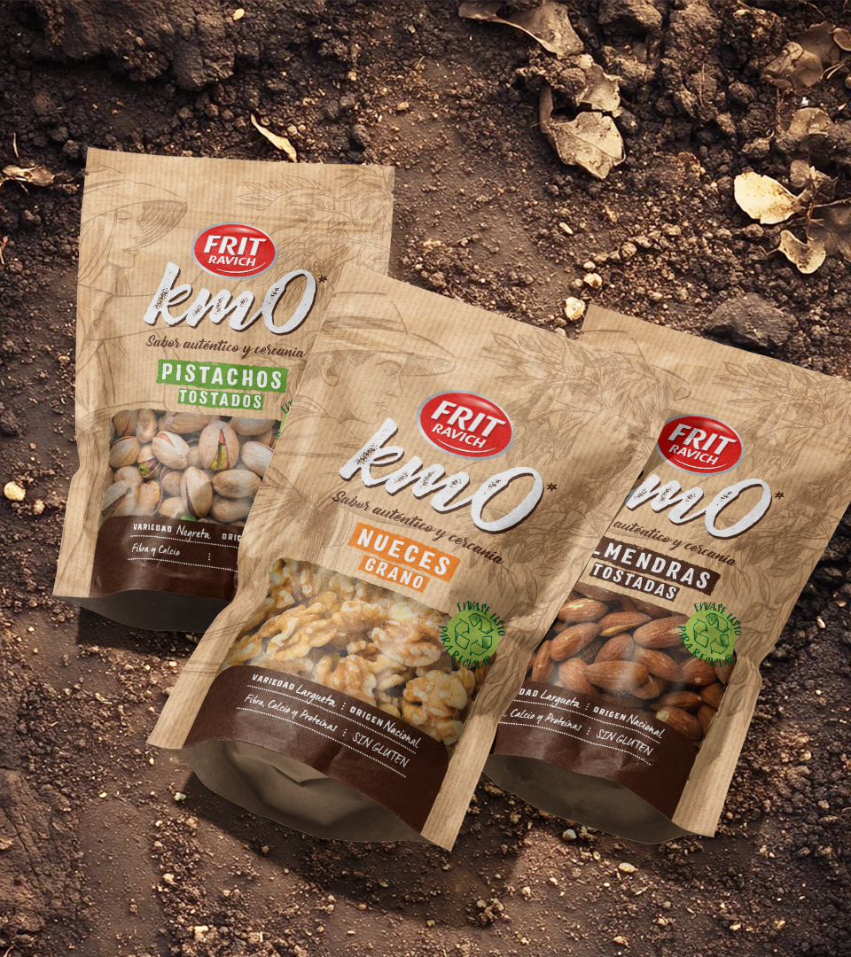
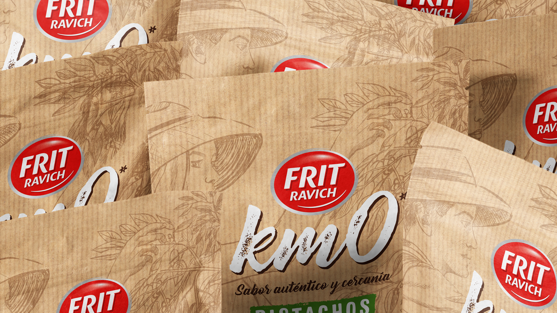
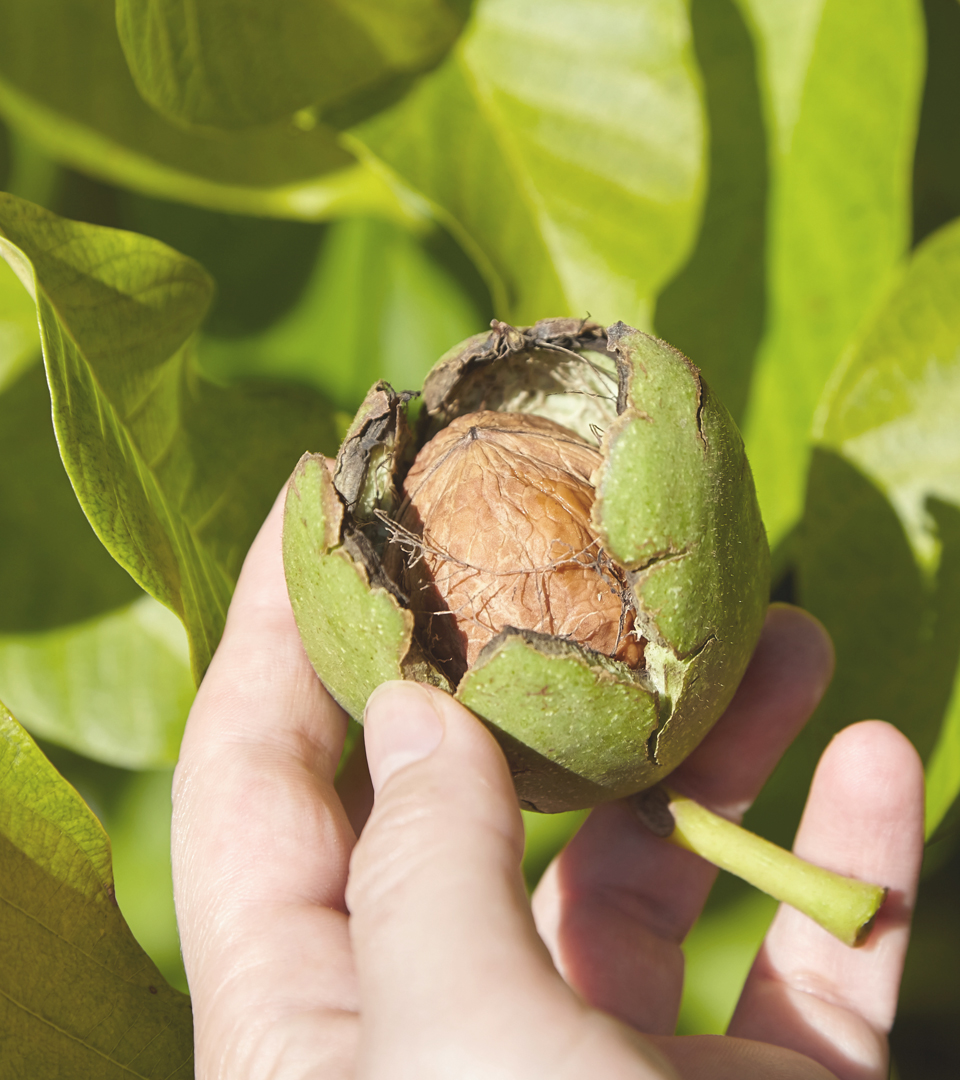
The new packaging design incorporates a kraft paper texture, enhancing the sense of naturalness and authenticity. o highlight the local origin, we integrated background illustrations that evoke the manual harvesting process, connecting consumers with the story and craftsmanship behind each product.
On the front of the pack, a clear informational panel details the origin, size, and benefits of each nut variety, maintaining a structured and functional layout similar to the Core range A color-coded descriptor system differentiates the varieties, ensuring easy identification and shelf navigation.
The result is a nut product line that blends proximity and quality, featuring a more premium image than the Core range, without losing its emphasis on naturalness and product visibility. A Km0 sub-brand reinforces the connection to local sourcing, emphasizing authenticity and Frit Ravich’s commitment to sustainability and community values.
*Designed for More Amor Brands.
Related Posts
Milucca Skin Care
Packaging
Música x Arquitectura
Graphic Design
AMMA
Brand identity
Let's Talk About Your Project
Or send us an email directly to info@estudioprimavera.com